Site Design Thoughts
From now on, I'm trying to have no more than one "blog post about how I want the blog to be" for every two days. I talked about myself yesterday, so guess what that makes today!
One choice I made right off the bat for the new theme was, I wanted to use the solarized colors.
- Per guidelines, use the base* colors for text and background, and consider using them for emphasis.
- Per web convention, blue for non-visited hyperlinks, violet for visited, red for active, and right now the protoype switches the background to highlighted on hover.
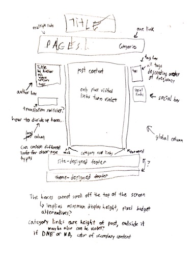
- I think I don't want violet for visited for stuff from the theme, only within the page content.
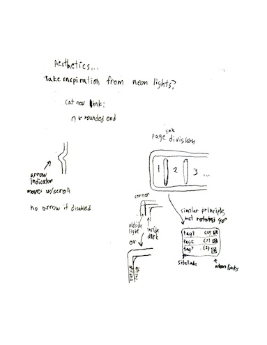
I've put together some quick sketches of ideas I have in mind here. Thrill as I recapitulate basic graphical concepts in a confused and confusing fashion!
EDIT 2018-04-04 12:09: I forgot about writing this down last night, but I'm also planning to switch some or all of the <pre> text to use Fira Code. One hurdle this has hit in prototyping is that the font comes out bigger than using the "monospace" family, and I don't know why yet.

